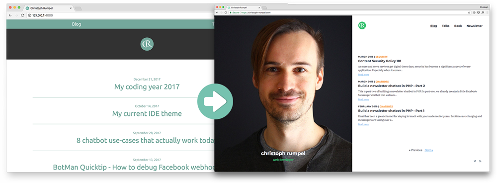
How I redesigned my blog and moved it from Jekyll to Laravel
#laravel #designOne of my resolutions for 2017 was to redesign my blog. One week before the new year I faced myself with the challenge and thought to myself if this was still doable. Somehow I managed it, and here it is. In this article, I will explain the process and show you how I redesigned the blog with Tailwind CSS and moved it from Jekyll to Laravel with keeping almost the same performance.
How to start
So where do you start when you want to redesign your blog? What I did was a list of things I wanted to change:
- fresh design update
- HTTPS
- moving away from Jekyll
Let's take a short look at each of them.
Fresh design update
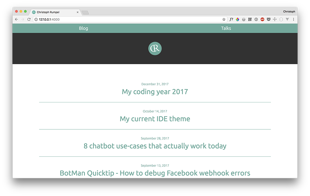
My old blog design was from 2014. I created it by myself and was very happy with it for a long time. It was super clean, simple and everything was about the content, without any distractions. But there were two problems. First, it was quite old, and I wanted a fresh and modern touch with new colors.
Second, it was never planned to use a menu. Last year I started doing more talks, and I wanted to list them on the site too. So I ended up with this temporary menu on the top. It worked, but I didn't like it.
HTTPS
Since Chrome is treating sites without HTTPS as insecure, you really should use a secure connection. I am not sure if this is still a problem, but in the past, it wasn't possible to use a GitHub Page with your custom domain and HTTPS.
Moving away from Jekyll
Jekyll is a great tool, and as a static site generator, it is super fast! But I didn't like the fact that I need Ruby to use it and I wasn't that big fan of the syntax. Since I use Laravel a lot, I always thought about using something more laravellike. Is this even a word? Guess now it is!
So the plan was to check out Jigsaw, a static site generator using Laravel Blade similar syntax. But I also talked to some people, and Freek mentioned that one of his colleagues has an excellent solution I should check. He was talking about Sebastian De Deyne and his blog. I was fascinated by the used stack and how fast it was. So I decided to give it a try.
The backend stack
First I want to mention that my blog's backend is heavily inspired by the one from Sebastian De Deyne. So thanks a lot for sharing Sebastian and give him some applause 👏 on Twitter! :-)
Here is the stack:
- Laravel
- Markdown articles
- YAML Front Matter parser
- Markdown parser
Laravel
So the base is a brand new Laravel 5.5 application. Routes are used to connect the endpoints with controllers and Blade is used to structure the layouts and show the content. Pretty basic Laravel stuff.
Route::feeds();
Route::get('/', 'HomeController@index')->name('home');
Route::get('/talks', 'TalksController@index')->name('talks');
Route::get('/{year}/{month}/{slug}', 'PostsController@show')->name('posts.show');
Markdown articles
My articles are stored as Markdown files. This was a must-have for me because I didn't want to change all the old ones. I like having my articles in Markdown. It is easy to write, and you're not distracted by a fancy UI.
YAML Front Matter and Markdown parser
To get these files to HTML, we need to parse them. In the gather method happens the central part of that.
private function gather()
    {
        return collect($this->disk->files('posts'))
            ->filter(function ($path) {
                return ends_with($path, '.md');
            })
            ->map(function ($path) {
                $filename = str_after($path, 'posts/');
                [$date, $slug, $extension] = explode('.', $filename, 3);
                $date = Carbon::createFromFormat('Y-m-d', $date);
                $document = YamlFrontMatter::parse($this->disk->get($path));

                return (object) [
                    'path' => $path,
                    'date' => $date,
                    'slug' => $slug,
                    'url' => route('posts.show', [$date->format('Y'), $date->format('m'), $slug]),
                    'external_url' => $document->external_url ?? false,
                    'title' => $document->title,
                    'category' => $document->category ?? 'general',
                    'contents' => markdown($document->body()),
                    'summary' => markdown($document->summary ?? $document->body()),
                    'summary_short' => mb_strimwidth($document->summary ?? $document->body(), 0, 140, "..."),
                    'preview_image' => $document->preview_image ? 'https://christoph-rumpel.com/'.$document->preview_image : 'https://christoph-rumpel.com/images/cr_image_v2.jpg',
                ];
            })
            ->sortByDesc('date');
    }
This is quite some code, but basically, this is what happens here:
- .md files are loaded from the disk
- The file name is split to get the date and the slug of the article. (e.g. 2017-12-31.my-coding-year-2017.md)
- Article content is parsed to get the metadata and the body
- An Object is being created from the given article data
Quite interesting is this line:
$document = YamlFrontMatter::parse($this->disk->get($path));
Here the Spatie yaml-front-matter package is used to parse the markdown file.
YFM is an optional section of valid YAML that is placed at the top of a page and is used for maintaining metadata for the page and its contents.
It is just some metadata that you can use and which looks like this.
---

title: "My coding year 2017"
categories: general
summary: "Another year has come to an end, and it is time for my traditional New Year's Eve blog post. I want to take some minutes to think back about the last 12 months and how they changed me as a developer."

---
I used something similar on my old blog with Jekyll. Here I also store my article's summary and a category type, but it is entirely up to you. $dodcument is now an object containing all the metadata. Additionally, everything else of the file (after the metadata) we can retrieve with $document->body(). So this is our Markdown article. We now also need to parse that.
'contents' => markdown($document->body()),
This markdown helper function then uses the Markdown parser by the PHP League to create HTML.
function markdown($markdown)
{
    return app(CommonMarkConverter::class)->convertToHtml($markdown);
}
In the end, we sort the articles by date, and now we have our post objects. They get also cached which you don't see in this example. This is like the core of the whole system.
Toughest decisions are the ones about design
I care about design because it is so crucial for every project. I often try to style things myself, but I am by far no designer. This is why I hate design decisions. It takes me so long because I often can't see the better solution. I have to try and try and try. Luckily I got some designer friends, and they help with great feedback; this time especially Angelika from my old company. Thx a lot! 🙏
New home
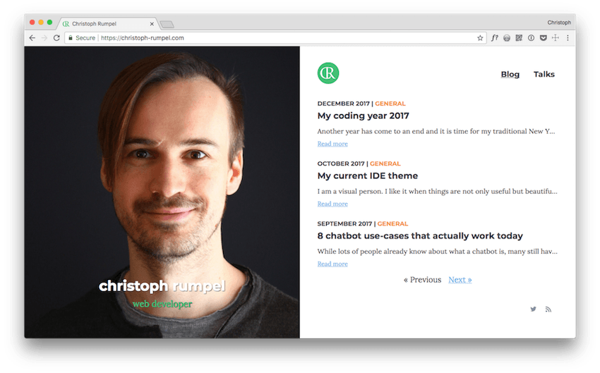
The homepage changed a lot. There now is this big photo of a random guy who might have been attractive some years ago but now is getting old and hairless soon. 😅
I like the idea of seeing a photo of the person behind the articles on the homepage, but it is still quite strange for me. Especially because it uses half of the page! Maybe I need to get used to it. I also hope I can change the photo someday. This was the only one I had which was big enough.
Finally, I got a nice simple menu too, which is great for showing my talks. (coming soon) I also think about an About page, but I'm not sure yet. The rest is pretty simple. There are the latest articles, a small logo, pagination and two links for Twitter and the RSS feed. It bothers me a little bit that you only see three articles per page, but it is tough when you use a full height layout without scrolling.
Colours
The new white background gives me the chance to introduce some new colors more efficiently than before. The primary highlight color is now a new fresh green which is used for the logo and my little "description" beneath my name. Then I got an orange for the categories and a light blue for the links. The rest are some grey variations. Overall the site is now more bright and colorful.
Articles
My site is mostly just a blog. Therefore it is all about the articles and to give the users a great reading experience. I think I did a good job there with my last design too. So what could I do to improve it? I did some research and checked a lot of sites. Most of the time I spent on Medium. They are doing a great job, and there is so much I can learn from their site regarding text and fonts.
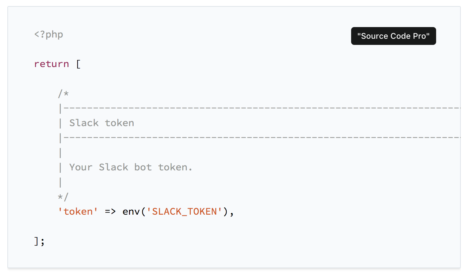
In the end, I had two goals. First one was to provide a better contrast to lighten up the background. The second one was to use a serif font. Guess we can argue here, but I think they are better for body text than sans-serif ones. I spent quite some time on Google Fonts to find the right ones. Now I use Montserrat as my display font for headlines and Lora for the body text. In fact, I have a third font too: Source Code Pro. It is used for the code sections. I didn't want to use another font, but it looks so good with this one. Below you can see the difference to the default monospace font.
For now, I have decided to use it, but we will see if I keep it in the future. Performance is, of course, outstanding too. More on that later. You can see the final article design on the current page :-)
Tailwind CSS
Also new in my stack is Tailwind CSS, a utility-first CSS framework by Adam Wathan, Jonathan Reinink, David Hemphill and Steve Schoger. From the beginning on I was very skeptical about utility frameworks. It is an approach that is very different from many best practices in CSS. I wanted to give it a try, and my blog was the perfect first real project to test it out. A real project is always the best way to dive into new technology.
My CSS background
I have been a front-end developer for about a year before I started digging into backend development. This was quite some years ago, but I did a lot of CSS. Back in the days, we used BEM, SMACSS, OOCSS and more to build modular, well structured and clean CSS, that was also completely separated from the markup. It wasn't always the best and easiest solution, but it worked quite well.
Last years I wrote almost no CSS at all. At the office, I only worked on backends, and at home, I just did some small projects. I also didn't check any new frameworks or best practices regarding CSS lately. So seeing a utility CSS framework was quite new to me and still is.
What I like about it 👍
It feels like very fast. Mainly because you don't need to think of class names anymore. 😅 As we know, naming is hard. Finding the right names for BEM classes was annoying. With Tailwind, you fill your markup with utility classes and check what it looks like. You see what works and what not. You change something and try it again. You get immediately in a good design flow. Of course, you need to learn about the utility names and the Tailwind CSS config file, but that's not a big deal. Especially with an IDE like PhpStorm, it is super easy because of auto-completion.
You also get used to it very easily due to the great documentation. It is spot on, beautiful and fast!
It was also great to built modules with utility classes due to the @apply helper. This way I can implement a module, if I need to, and still use Tailwind's utilities. Also, the @responsive helper is great to use the Tailwind responsive features with your modules. Find both examples below.
.note {
    @apply .bg-red-lightest .text-red .mt-4 .mb-4 .pt-4 .pr-8 .pb-4 .pl-8 .font-serif;
}

@responsive {
    .profile-column {
        background: url(/images/cr_image_v2.jpg) no-repeat top center;
        background-size: cover;
    }

    .blogimage {
        @apply .m-8;
    }
}
What I don't like about it 👎
First I had some difficulties to set it up. I wasn't sure about how to integrate it into my Laravel application. There is a Laravel preset, but it is not well explained how it works. How do I start it? How is it connected to Laravel Mix? What do I need to do when I change the Tailwind config and so on. In the end, it wasn't that difficult to figure it out, but it took some time though.
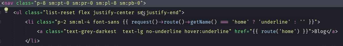
It is still very odd to me to write all the utility classes in the markup.
<div class="relative overflow-hidden w-full sm:w-1/2 flex justify-center">
    <div class="hidden sm:profile-column sm:flex items-end p-8 justify-center h-full w-full bg-center text-white">
        <div class="text-center sm:pb-8">
            <h1 class="mb-2 hidden sm:block text-sh text-shadow text-white">christoph rumpel</h1>
            <p class="text-green text-xl hidden sm:block text-shadow">web developer</p>
        </div>
    </div>
</div>
You have been told not to do that for quite some time, and this is saved somewhere in you. It also looks very messy. But in the end, it is just a habit you can get rid of with only time. That's what I hope. Additionally, the markup gets more complicated to read. Let's take this part of my markup as an example. What is this list for?
<ul class="flex flex-col p-0 mt-0 mb-0 sm:justify-center w-full white flex-grow">
You have no idea without checking the whole page or the content. In the past, this list had a class like articles-list, which made the purpose clear.
Another thing I noticed is that sometimes it feels like you get lost in your utilities, and you lose control of the overall style of the site. What I mean is that it is difficult to stay consistent. Did I use the same padding here that I used on the other page? Was it p-8 or p-6? How do you keep track of stuff like that? This was easier when you had all the styles together. I am not sure yet how to solve that for my next projects.
I'm also not sure if I would recommend Tailwind CSS for big projects yet. Not because it is not finished yet. It is on a good way but because it is still young and difficult to predict its future. This is the same with every new tool, and this depends on your company, the team and the projects of course too.
Conclusion
I was amazed and impressed while working with Tailwind CSS. I didn't think that I would like it that much. It feels fast, fresh, intuitive and I enjoyed writing CSS again. You should check it out if you haven't yet.
Make it fast
As I already mentioned I used a static site generator before. Therefore my site was super fast!
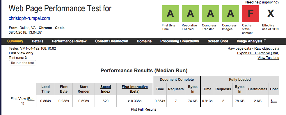
Besides the caching note, the stats are almost perfect. Especially the speed index is incredible with 620.
Simply put, speed index is how many milliseconds it takes for the visible parts of a webpage to be displayed (KeyCDN Blog)
I know I wouldn't be able to get the same score with a PHP application. So the goal was to get as close as possible. So here are some steps I took.
Images
This is quite boring but still very useful. Smallest images are the one that you don't need. So I think very carefully before using one. I don't use them for every article. My blog is about the content, and I don't need to persuade anyone with a nice preview image to read an article. Then, of course, I am optimizing every image. On my Mac, I use imageOptim, and on the web, I used this to optimize JPEG files.
Still, it got more complicated for me because of the big photo on the homepage.
Caching
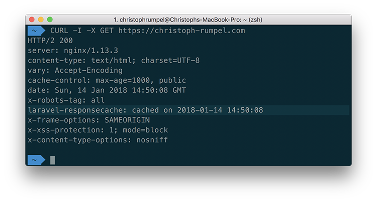
One of the reasons for me to choose this stack was the Spatie Laravel Response Cache. It caches complete responses and is excellent for the performance. When you're app is in debug mode you can see the additional cache header.
Additionally, the blog articles get also cached because it takes some time to convert the Markdown files to objects.
Turbo magic
Sebastian also uses Turbolinks. I've heard of them several times before but never tried them. It's quite some magic, but it works like that:
- you insert the Turbolinks script
- user clicks a link on your page
- instead of changing the site, the script loads the request in the background
- then merges the loaded content into the page
- and updates the URL
The only thing you will notice is the performance improvements. It is much faster than a full page load. It feels a little bit scary because it works so good and is so easy to install.
I am glad I tried them, and for me, they work perfectly.
Clean up TailwindCSS
By default, TailwindCSS is quite heavy. This is because it comes with a set of features that are great to start and to play around. When it comes to production, you should remove the parts you don't need. Here you will find a list of tips on how you to keep your CSS file size small.
I was able to reduce the file size from 40,1KB to 26,1KB. 💪
Final performance results
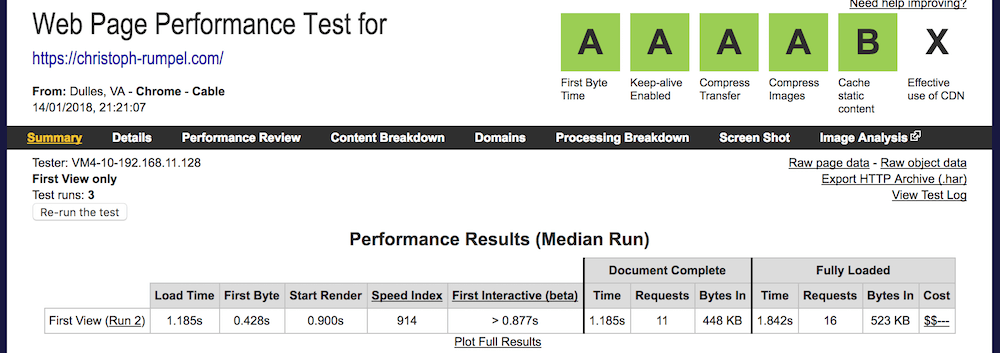
These are my final scores. I am pleased about them because the speed index is with 914 under 1000. This was my goal! Not as fast as my site before but still very close. I only got a B for caching. To get an A here, I would need to use a CDN. I will think about that, but I'm happy for now.
Summary
Wow, this was quite a journey. Congratulations if you made it till here. I hope you like the new site as much as I do and I hope this article was of use to you. If you got any feedback or questions, don't hesitate and contact me on Twitter.