Front-end performance part 02: Images
#performanceI'm too old for this sh**.
This post has already become quite old, and a lot has changed in that field since I wrote it. The examples I provide might not work anymore or are not suitable for how we work today. Please be aware of that while reading it.
Since we use lots of images in our designs, it is crucial to talk about them too. We will go through everything you need to know about them, new techniques and how we should treat them. Usually we can improve performance here the most.
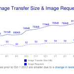
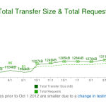
Let us take a quick look why images are of tremendous importance when we talk about front-end performance. As you can see in the statistics from HTTP Archive below the total transfer size of websites increases steadily. This May 2013 an average websites weights 1427kB. More than 60% of this size belongs to images.
This is a lot, but because of that we are also able to decrease the total size easily through optimizing images. We will go through a 3-step process.
1. Do i really need this image?
First you should think about whether you really need this image. Sometimes it is not necessary or you can replace it with a CSS effect. Especially with CSS3 we have much more possibilities to reduce the number of images and thereby HTTP requests.
2. Appropriate file format
Improving images starts with their creation or at least with their export in the right file format. So what file format is the right one? Generally PNG is the best choice for all images except photographs where you should use JPEG as format. You have to find the lowest acceptale settings in order to get the best result for your purpose. Always try to find the balance between file size and quality.
Some more words need to said about progressive JPEGs. When you save images as JPEGs your are able to save them as progressive ones. Normal ones called baseline will load full-resolution top-to-bottom. This means every line is being rendered separately. You have certainly seen this effect on slow sites. Progressive JPEGs are made up of several different quality versions of an image. A low-resolution version of the image is loaded first and will be seen instantly as a whole image on slow sites. Even if the image is blurry first, the user will have a better experience. I just have to mention that progressive JPEGs are sometimes bigger than baseline ones, but this is what Ann Robson from Performance Calendar thinks about it:
Progressive jpegs are better because they are faster. Appearing faster is being faster, and perceived speed is more important that actual speed. (Ann Robson)
And she is right. If the user is not recognizing that something is faster, it is of no use.
Last when your are working with Adobe Photoshop don't forget to "Save for the web..." which will delete unnecessary data like information about the camera the photography was taken with.
3. Optimizing images
Next step is about how we can optimize our images. Saving images for the web is a great start, but there is still more to do. They still contain extra information which we don't use and which will make our file size larger than it needs to be. In order to slim our images as much as possible there are great applications and online tools for optimizing them available. They can decrease file sizes tremendously. My online tool of choice is Kraken Image Optimizer. Additionally i use the Google PageSpeed extension which tells me which of my images could be reduced in file size, how much that would save and automatically serves me these optimized images as well. Awesome right? Of course you can use other tools and applications. Just take what fits your needs.
Another good approach of improving images is through sprites. Putting images together is usually good practice when a set of images needs to be loaded always together and when small random images would cause a lot of overhead per request. With CSS preprocessors or online tools it is nowadays possible to directly generate sprites. This is really helpful and saves a lot of time. Read more about modern usage of sprites in this fantastic Smashing Magazine article here.
There is still more we can do
Besides this 3-steps process there is still more we can do when we are dealing with image performance.
One easy thing to do is to help the browser by defining width and height for images. With this information it allows faster rendering and prevents rescaling. It is always good not to rescale images. This will help avoid unnecessary repaints and reflows during rendering.
Another technique you should know about is data URI. It stands for uniform resource identifier. It indicates a protocol for receiving information. An URL is an URI, but not every URI is an URL. So what is this URI thing all about? Instead of writing an address of a file, it is possible to write the date of the file.
.icon-foo {
  background-image: url('data:image/png;base64,iVBORw0KGgoAAAANSUhEUgAAAAEAAAABAQMAAAAl21bKAAAAA1BMVEUAAACnej3aAAAAAXRSTlMAQObYZgAAAApJREFUCNdjYAAAAAIAAeIhvDMAAAAASUVORK5CYII%3D');
}
This means there is no need for an HTTP request since we already have all information about an image we need. All browser from IE8 and above support this technique. Disadvantages are that our CSS or HTML files will get bigger and that we are not able to cache images. Another one is that it takes more time to change an image, because you cannot just replace the file like you would probably do. It is not recommended to use date URI if GZIP is turned off on your server.
Retina images
Since new devices pack more and more pixels into the same place as older ones, we have to deal with that situation too. There are already some great articles on how to implement images for all devices correctly. I just want to mention the performance aspect here. Important is not to serve all devices the same images, unless they are resolution independent like SVGs or icon fonts. Make sure not to let the browser loads huge images if they aren't necessary.
...the best case is when you can use resolution independent formats like SVG...One way to serve the right one is
through media queries in CSS. Simply define another background image if the device pixel ration is higher.
.repeatingPattern {
    background: url(../images/bgPattern.png) repeat;
    background-size: 100px 100px;
}
@media only screen and (-webkit-min-device-pixel-ratio: 2) {
    .repeatingPattern {
        background: url(../images/bgPattern@2x.png) repeat;
    }
}
But as mentioned above the best case is when you can use resolution independent formats like SVG which will look almost perfect on all devices. Exported from an application like Adobe Illustrator you can treat them like normal images in HTML.
<img alt="Icon of a heart" src="icon_heart.svg" width="100" height="100" />These vector files are small in size and will look crisp on retina displays. Here are some examples of a SVG image. Everyone weights just 3KB and i can scale them without losing quality.
If you are like me you will probably take a deeper look at how i used images on my own site. I still use a lot of PNGs but i will change the most of them to SVG files when i find some time. In this article by CSS guru Chris Coyer he explains all you need to know about using them correctly. Furthermore he provides some handy fallbacks for IE8 and below.
Icon fonts is another modern way of providing resolution independent images. This technique is using @font-face with icon fonts, which hold monochrome glyphs instead of the alphabet inside. To implement an icon you need to specify the font on the letter corresponding to the desired icon.
.icon {
  font-family: 'Icon Font';
}

<span class="icon">a</span>
Looks crazy right? But this is a totally handy and popular technique to provide infinity scalable glyphs.
A big downside here is that you need to regenerate the whole font when you change the glyphs. Additionally if the font embedding fails we will end up with strange meaningless characters which provides bad accessibility.
To optimize the typographic representation of these consecutive characters, they are combined into one glyph.
One solution here is to work with ligatures. They are special characters of a font which will replace certain combinations of letters like "ff", "fl" or "fi". To optimize the typographic representation of these consecutive characters, they are combined into one glyph.
We can profit from this behavior and address our glyphs with semantic text. This is a much nicer way of implementing icon fonts which provides better information for search engines too. Here is what an icon menu could look like in markup. Much better!
<nav>
    <ul class="nav nav--main">
        <li>Home</li>
        <li>Blog</li>
        <li>Portfolio</li>
        <li>contact</li>
    </ul>
</nav>
Conclusion
That's it for this part of the series front-end performance. As you could see there are just a view simple steps you have to consider when dealing with image performance. Start thinking about them right from the start of your project and include them in your workflow. Take some time to practice with new techniques like data URI or icon fonts since they are already very popular and will play a bigger role in the future. Stay tuned for the next part of the series. May performance be with you!
Resources
Online Testing
Browser Extensions Further reading