How I Built Laravel Core Adventures
#design #performance #laravelMost interesting about a new product, except the product itself, are the little details and decisions that shaped it to what it became. This article is my approach to tell you all the problems, ideas, and solutions that created Laravel Core Adventures. It is not rocket science, but it is REAL.
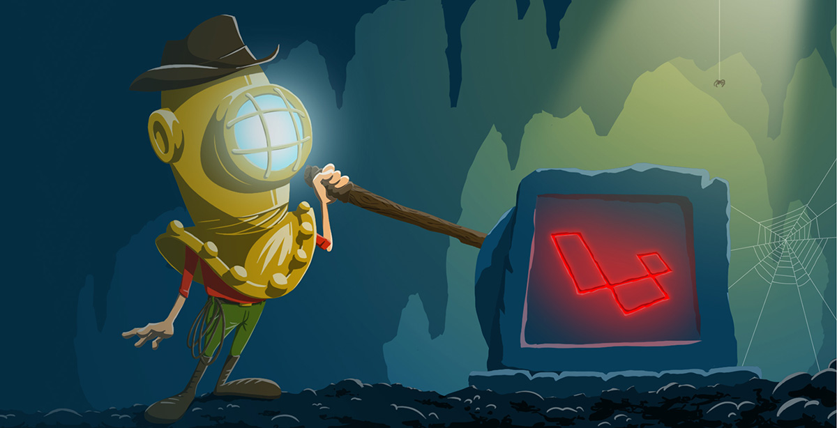
About
Laravel Core Adventures is a free video series where I teach about how Laravel works under the hood aka the core. The idea is to pick a Laravel topic like Facades and then make little videos to explain important aspects of this topic.
Right now, Laravel Core Adventures consists of two categories, eight videos and over an hour of content. But behind the scenes, I'm already working on the next category and videos.
Tech Stack
The stack of this project is pretty simple and boring. I'm using:
- Laravel 5.7
- MySQL
- Vanilla JS
- Forge
- Spatie Response Cache
The Laravel project consists of one layout file and two templates for the welcome/overview and the detail page. All the categories and video details are stored in the database and get updated over Laravel Seeder classes. This way I don't have to touch the tables itself.
The site needs a little bit of JavaScript for smooth scrolling and the category animations. (more about the animations later) There were at least ten times where I thought about using Vue.js, but in the end, I didn't. The goal for this project always was to keep it simple as long as possible and needed.
Design
I always try to design such projects myself. And with design I mean finding something similar to what I want and copy it. I'm no designer at all, but still, the visual appearance of what I build is critical to me.
You Got A Friend
Since it is a free product, I also couldn't just hire a designer, and I was ok with that. I knew I could make the site look ok and keep the focus on the videos. Still, I was thinking about getting a logo, and so I asked a good friend of mine. He and his cousin have their own company called complemind, where they do all kind of graphic design projects.
So I told my friend about the idea of Laravel Core Adventures and connection to Indiana Jones. It should become more than a video platform. It should be about adventures and fun. He liked the idea and agreed to help me, but...
It was a big BUT! He and his cousin would help me, but they wanted to do more than just a logo. They wanted more illustrations, maybe a character and all in a style of their choice. So they had the opportunity to try out something new, and in return, I would get their help. Of course, I said yes :-)
The Micro Site
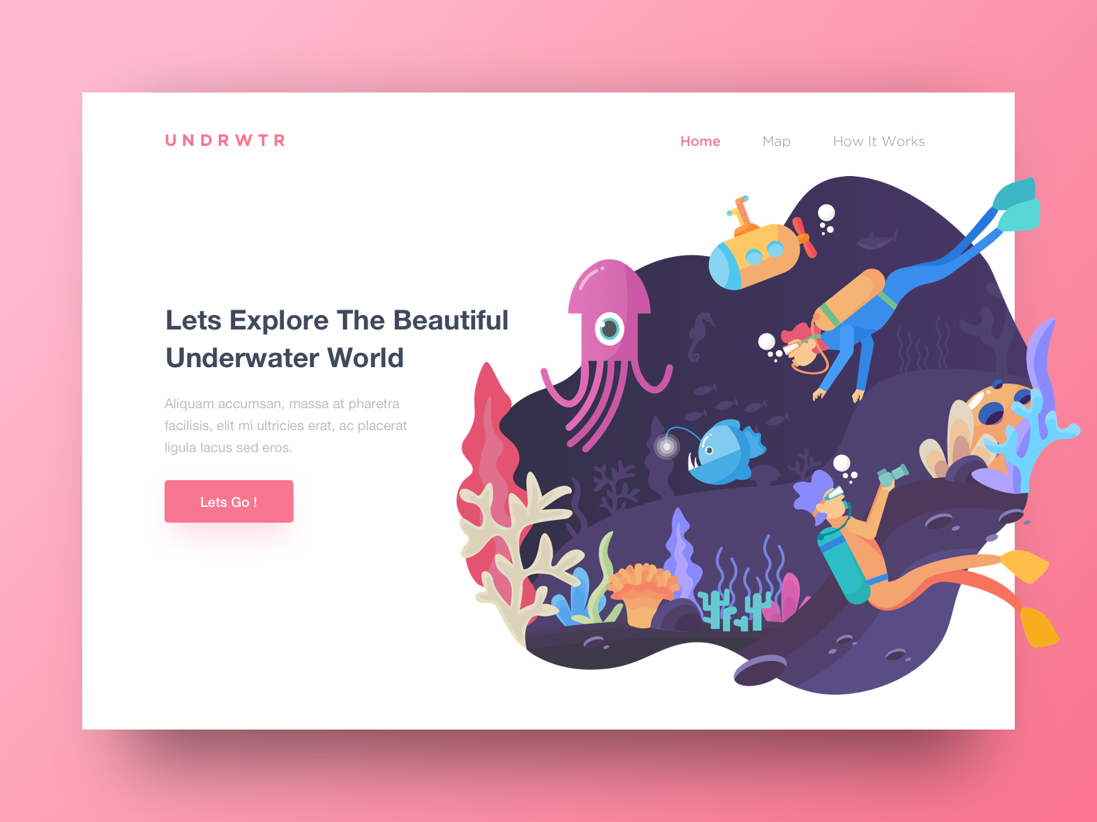
It all started with this landing page example I found on Dribbble. I wanted the micro-site to look as clean and exciting as that.
While I was working on the application and the overall design of the website, these were the logos that we started with.
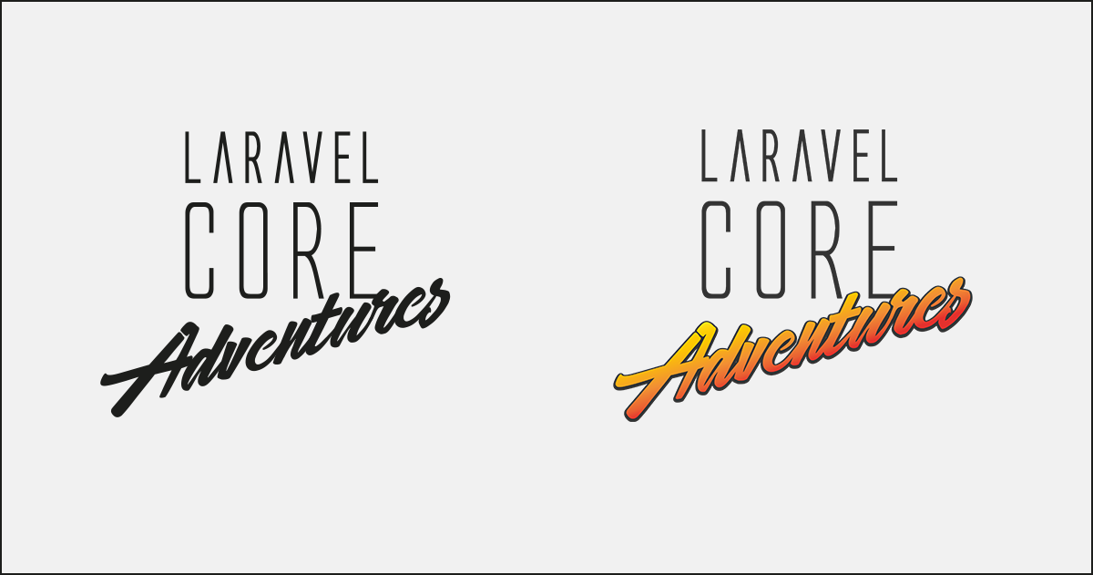
- The left logo already looked great, except for the color. Just black wasn't an option for me.
- We released the site with the second logo from the image above. It looks much more alive, and the connection to Indiana Jones is perfect.
Now that we had the logo, I started thinking about other colors for the site. Since the logo was already very colorful, it wasn't too easy to find a highlight color for the website. (button, links, etc.) In the end, I went for a teal, similar to the one on the right.
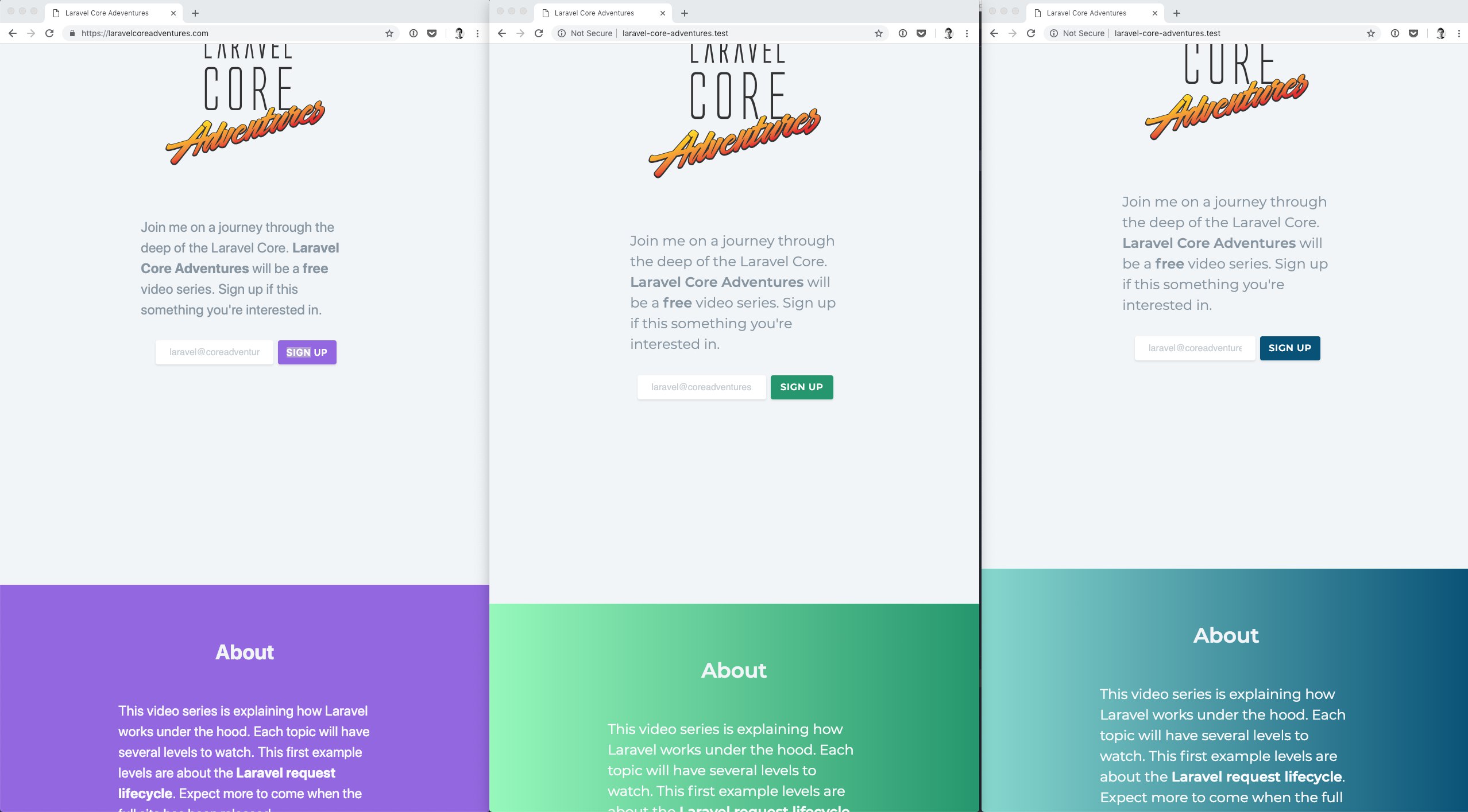
The content of the site was an easy decision:
- Section 1: short info + call to action = newsletter
- Section 2: more info
- Section 3: example videos
- Section 4: info about myself
Full Site
After receiving great feedback for the release of the microsite, I already knew I had to work on a full site now. People were interested in this kind of videos, and the concept seemed to be a good one.
The full site should provide:
- sections for different categories
- lists of the videos
- a detail page for watching a video
- an option for donations
- an illustration in addition to the logo
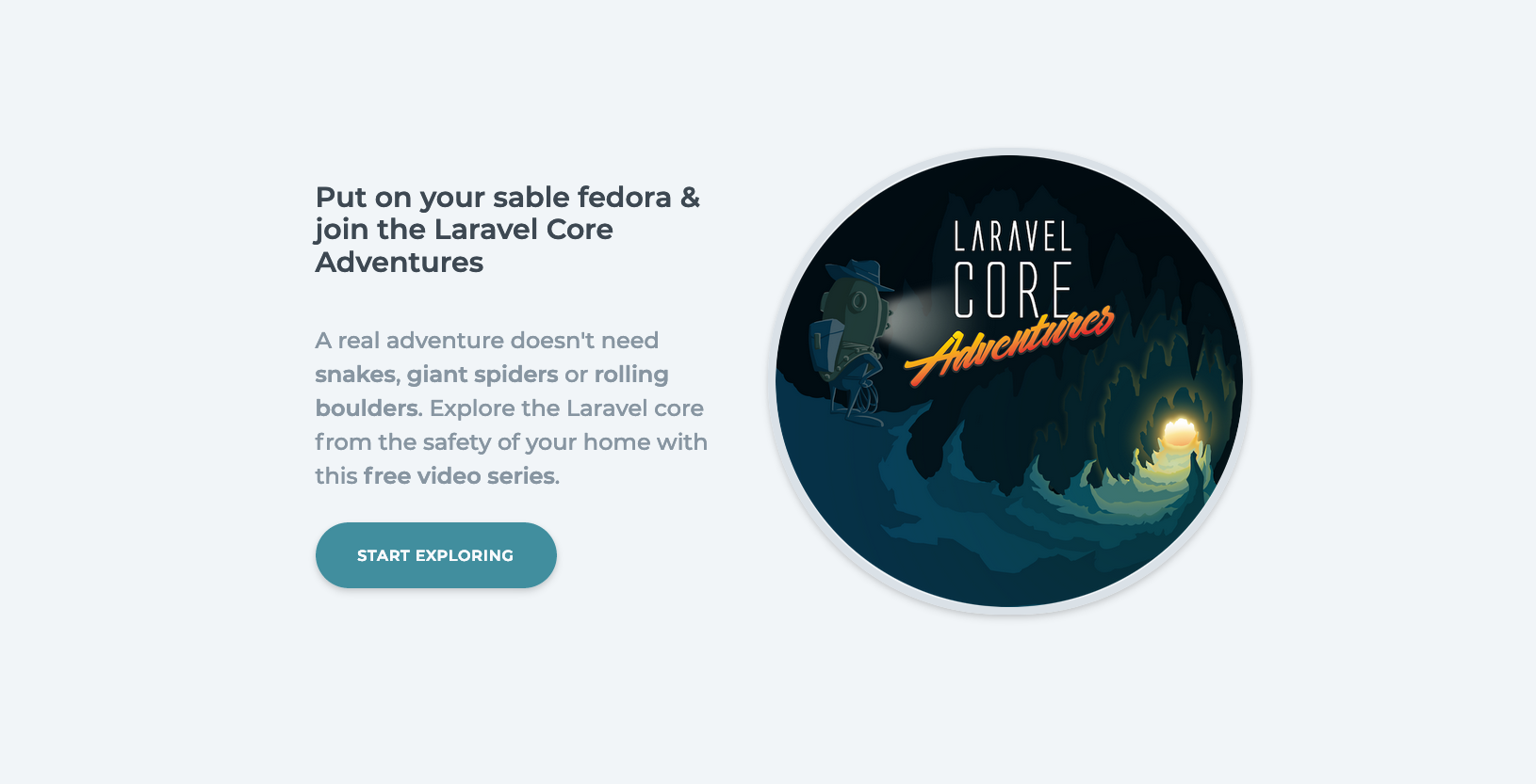
The new header is my absolute favorite section. The designers did great work with the new illustration, and I still love how simple this first part of the website is.
It was hard for me to remove the newsletter form from this part because it was working so good. Still, I learned from the book I'm currently reading (Company of One by Paul Jarvis) that it is more important to serve the given users. Getting an email is one of the main priorities when you have a micro-site where you check people's interest in an idea. But now with the full site, the priority of a user is to start a journey and watch a video. So I moved the newsletter form down beneath the categories.
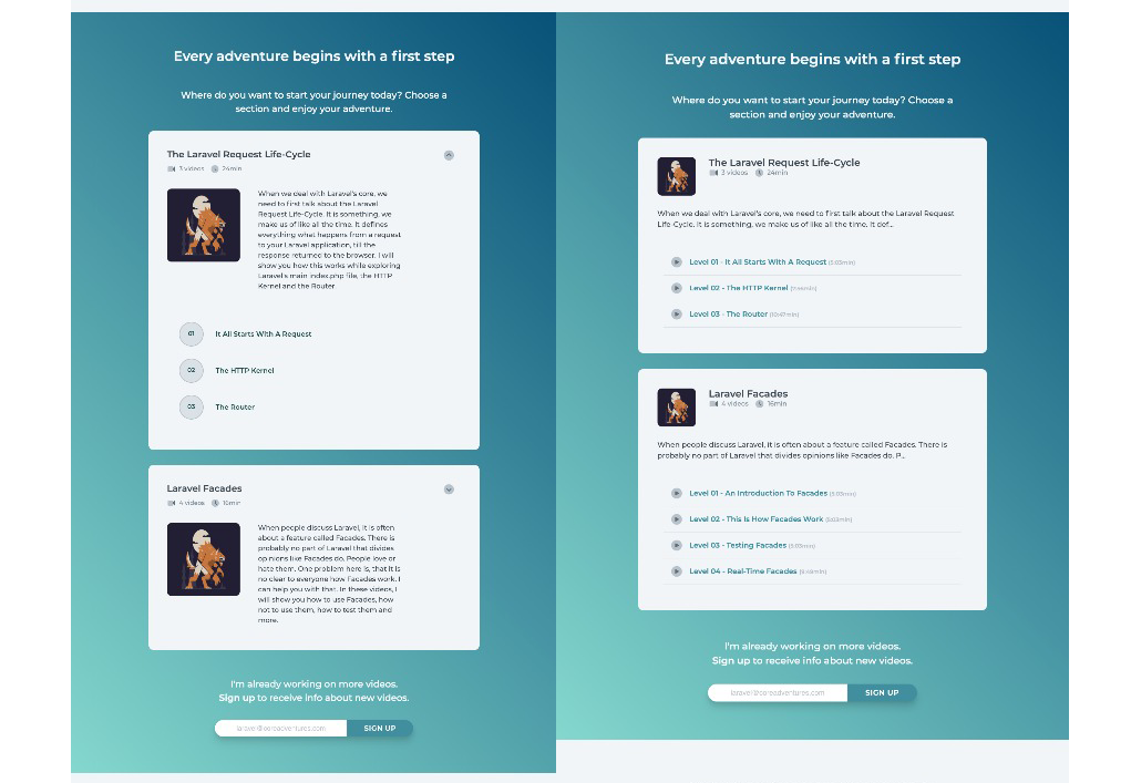
I had the hardest time with the layout of the category section. It took me endless hours and lots of discussions with designer friends to come up with this current solution. Beneath is a screenshot from an older version where I was using collapsable lists for the categories and the current one.
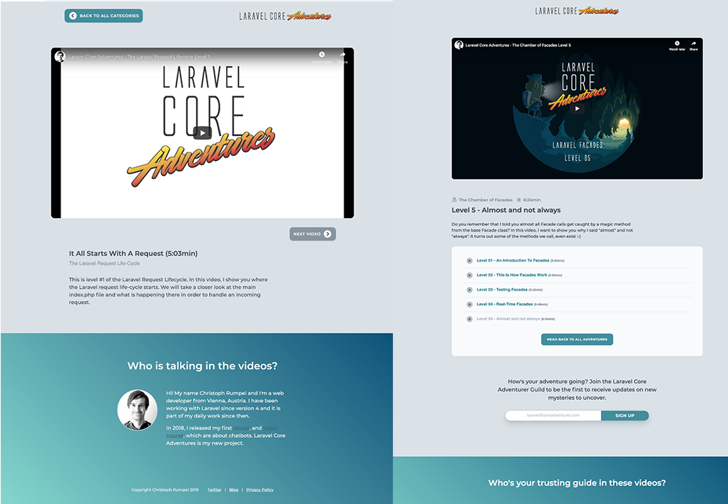
And last but not least, there is the detail section. The biggest problem here was that I don't have a typical logo or navbar on the welcome site, which I could use here as well. This is why we decided to create a horizontal text logo as well. Here I also got a comparison of an older design of this site and the current one.
Animations
When I got the first illustrations for the category images, the designers Markus and Martin also had an idea about animating the images. They sent me a video of what they had in mind. The animation looked exactly like it does now on the website, but it was a video.
I knew I couldn't use the video, because of performance reasons. It was almost 4MB in size. This is way too much if you want to provide your users with a fast website. So my first idea was to try a kind of parallax effect instead. The designers provided me with different layers for the background, the character, and its legs. Then I decided to animate each layer while the user scrolls so that it looked like in the video. It took me about four hours to realize this is not possible. I came to a solution close, but I wasn't satisfied. These parallax effects work great with just different layers of background that you move differently while scrolling. Animating a bending knee is different.
Canvas To Rescue
I almost told them that it is not possible when I had an idea. What if I tried to implement the video in a better way, than trying to recreate the video. After some research, I found a library called canvid. It lets you play a small video on the canvas element. It works like that:
- Export all frames of the video as images
- Combine the images in a sprite
- Load this sprite with canvid
- Play the video with canvid
This was amazing. I now could modify the current frame of the video, depending on how the user scrolls. The user goes down; I increase the current frame. The user goes up again; I decrease the frame which is like a rewind. Perfect! The only thing I needed to check was if the image was in sight. This can be done pretty easily with JavaScript.
The only problem was the size of the sprite. In the beginning, it was over 1.5MB which is way too much. Luckily I could optimize the sprites to under 400KB. Jackpot! Here is how such a sprite looks like.
I was now able to implement these nice animations without scarifying the performance of the site.
Videos
Laravel Core Adventures would be nothing without the little videos where I speak to you. So here is my current workflow for creating them.
Research
First I decide on the next category. I already got a list of things I want to cover, but no order. I pick what interests me the most at that moment. Then I'll start my research. Most of the core implementations I talk about are entirely new to me as well. I've seen most of the files and methods, but I never took the time to put all the dots together. And let's be honest, Laravel is a complex application.
While my research I take pieces of code and try to follow what is happening. I also read a lot about those topics, if I find good articles. I have to admit there are not many of them for what I need. On the other hand, this means I'm providing something new and hopefully useful.
The Plan
After my research, I hopefully have a good overall understanding of what is happening. Now the hardest part starts: Thinking about a way to teach what I have learned.
Teaching isn't just about providing information about a subject; it is about finding the right approach of explaining to reach a listener and help him.
My goal is to create an example that helps to understand what I try to teach. Then, of course, everything needs to be split up in small and easy to consume videos. When I have a plan for this, I start recording.
Recording
Here the most challenging part is to find the correct words. It should sound professional, but still easy to understand and without useless buzzwords. And of course, you should speak loud, clear and fluently while coding; and all of that in a foreign language :-)
After recording, editing starts. In my case, I still need to edit a lot. I hope this will get better with every new video. Then I need to upload the videos to Youtube, create preview images, add inspiring titles and descriptions and update the website of course. In the end, it adds up to a lot of work.
- Research:
one week - The plan for the videos:
three days - Recording:
two days - Editing:
one day - Uploading, images, text, release...:
one day
Youtube
You probably have already seen that my videos are hosted on Youtube and embedded on the Laravel Core Adventures website. But Youtube wasn't my first choice.
In the beginning, I tried Vimeo. Next, to the hosting service, you can also use the Vimeo player. Jeffrey Way uses it on Laracasts. What I like the most about it, is the beautiful and clean interface. You don't get that when you embed a Youtube video, because the customization options are limited. Additional, you have to live with video suggestions at the end of every video. Not so cool if they don't fit. (they mostly don't)
In the end, the decision still came in favor of Youtube, because this way the videos can also be found on Youtube itself. This is a massive benefit if you want to reach many users, and since my course is free, this is essential to me.
Donations
As mentioned, a section to donate to Laravel Core Adventures was planned on the website. I want to keep the platform free, but I like to provide a possibility to support it. Until now I have spent over 150 hours of work into this project, but I don't want to complain. Nobody forced me too. Still, I would love to see a little financial support to cover costs for Digital Ocean or Laravel Forge for example.
The reason I didn't include the donation buttons is the EU. For digital sells to EU citizens, I have to collect local taxes. (VAT) This means I have to calculate and raise taxes for every donation I get. Then I have sent this money back to the EU so that every country gets their taxes back. The amount of work to make this happen is much higher than the value of the donation itself. It only makes sense if you sell a lot of products at a good price. In my case, I sadly had to skip this idea.
I'm still thinking about how I could let people support Laravel Core Adventures. If you have an idea, please let me know!
Future
Now after the website is finished, I have my focus on providing more content. I'm already working on a new category and hope I will be able to release it soon. If you have any questions about Laravel Core Adventures or want to provide feedback, please contact me on Twitter.
I wish this platform will:
- help many developers to understand Laravel better
- create better developers
- make me a better teacher
Did you like this kind of in-depth article? Check out How I redesigned my blog and moved it from Jekyll to Laravel.