My Current Dark And Light Theme in 2019
#setupThere are two hard things in computer science: cache invalidation, naming things, and deciding which editor theme to choose. I've been lately trying out a light theme and wanted to take the chance also for looking for a new dark one. In this article, I show you where I ended up with my themes.
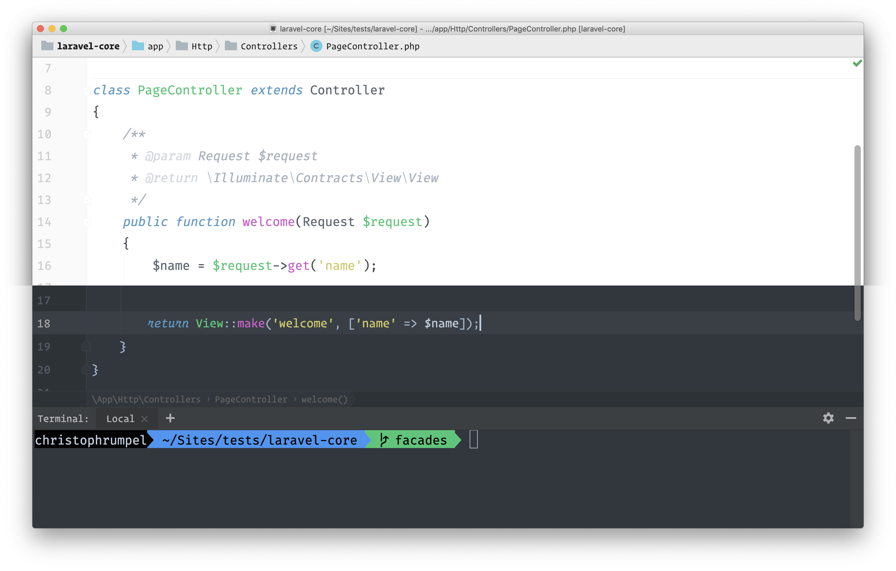
I'm looking all day at my editor, and this is why I care about what it looks like, and this is why themes are essential to me. I want to feel comfortable with the tools I use, and design is a big part of that. After switching my IDE theme in 2017 it is now time for another change.
Light Or Dark
This has been a big question lately: Should I use a light or dark theme? It all started with light themes quite some time ago. Then, some years ago, it was cool to use a dark theme. People also sad it was better to read and better for your eyes.
Then, last year, I saw more and more developers changing back to a light theme, and now it is a trend. There have also been researches showing that light ones are better for your eyes after all. Brent is dealing with this topic a lot.
I am still a fan of dark themes, but in the end, it comes down to personal taste. Every look has its advantages and disadvantages. Make your own opinion and decide for yourself.
I wanted to give the light side a try and customized a theme so I can use it as a light and dark theme.
The Theme Is Just One Piece Of The Cake
There are a lot of things that define your editor's visual appearance. A theme mostly defines just colors. There are exceptions to that, but mostly this is the case. Besides colors, you then also have to think about a font type and font sizes. If you have a shitty font, your editor will look shitty as well. It is important to match all these parts together:
- Color Theme
- Font
- font Sizes
- Console
I have also added the console to this list because some editors let you use their integrated console. I use it all the time with PhpStorm. In this case, it is also important what your console looks like, which could be a topic for itself.
What Theme I Currently Use
Now, when I say theme I'm referring to the overall look of my editor. If you find a better word let me know. Let's go through each of the parts together.
Color Theme
This time I tried some new color themes from Rainglow by Dayle Rees. He got a huge collection of beautiful light and dark themes. I have looked at all for them and decided to go with Jewel.
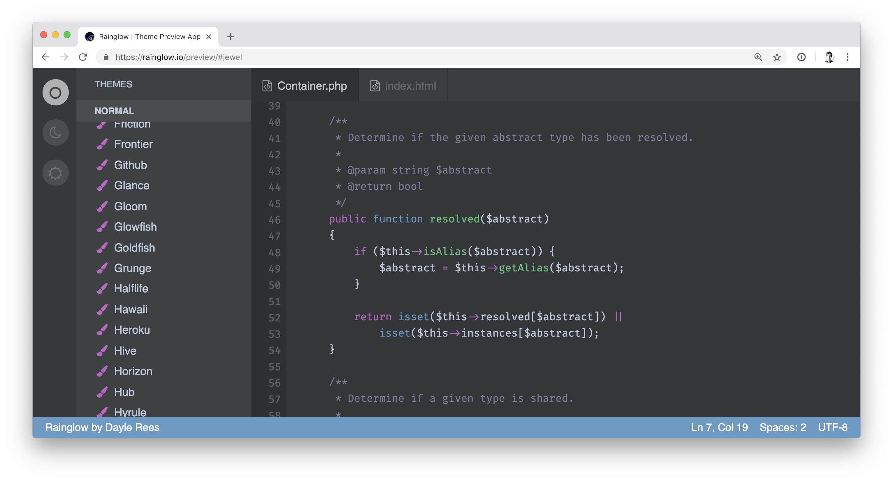
I did the same search for my light theme, and surprisingly I went for Jewel here as well.
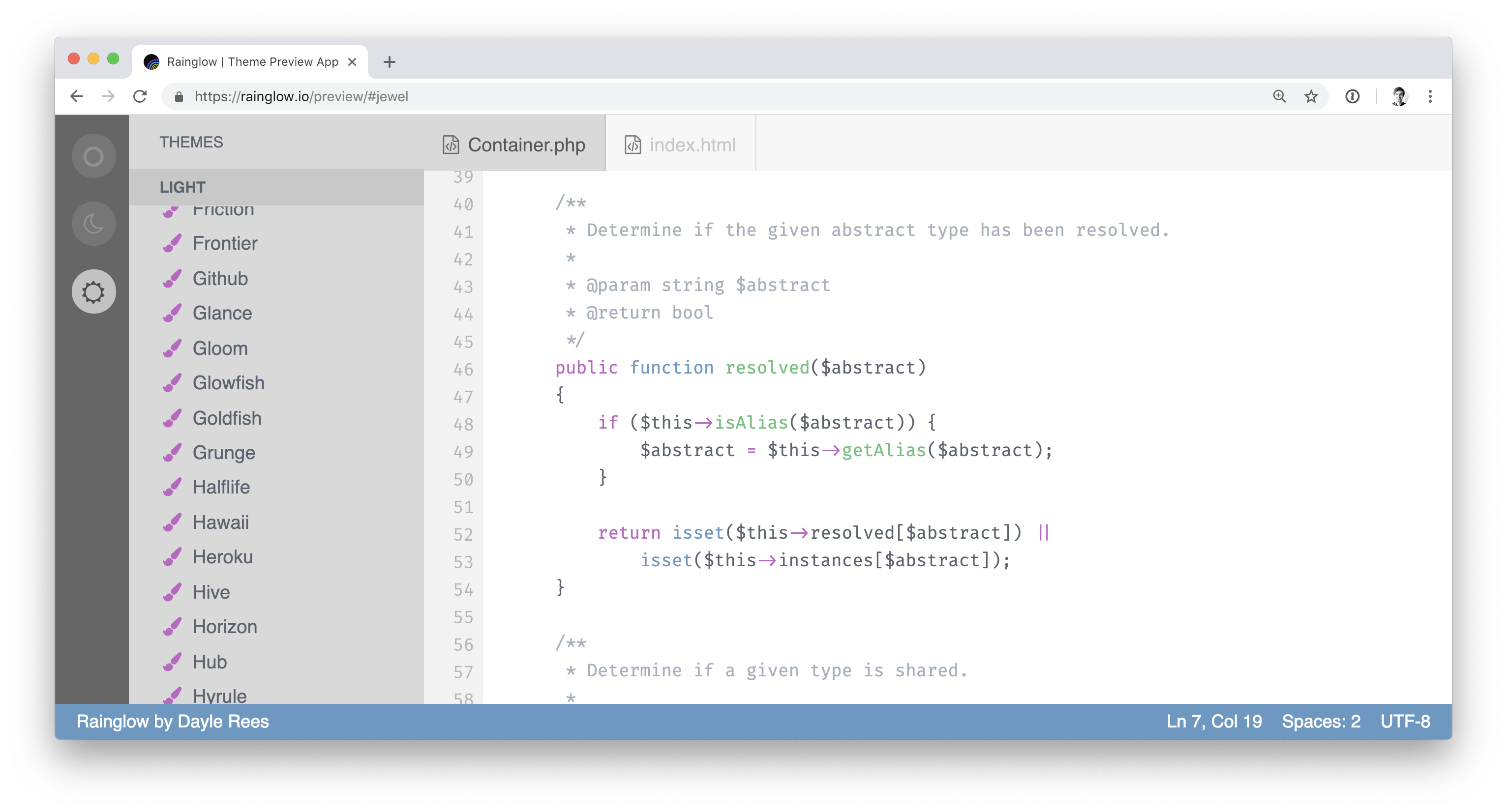
I like bright colors and good contrast. This led me to Jewel.
Font
When you first install a theme into your editor, it will probably look awful and entirely different from where you have first seen it. I mentioned it already. This is because the theme only defines your colors. There is still some work to do to make it fit your needs.
I always wanted to use Operator Mono. It is the most beautiful code font out there, but it is really expensive. (starts with €199) So I was looking for a similar one which is a bit cheaper. (Christoph Rumpel 2017)
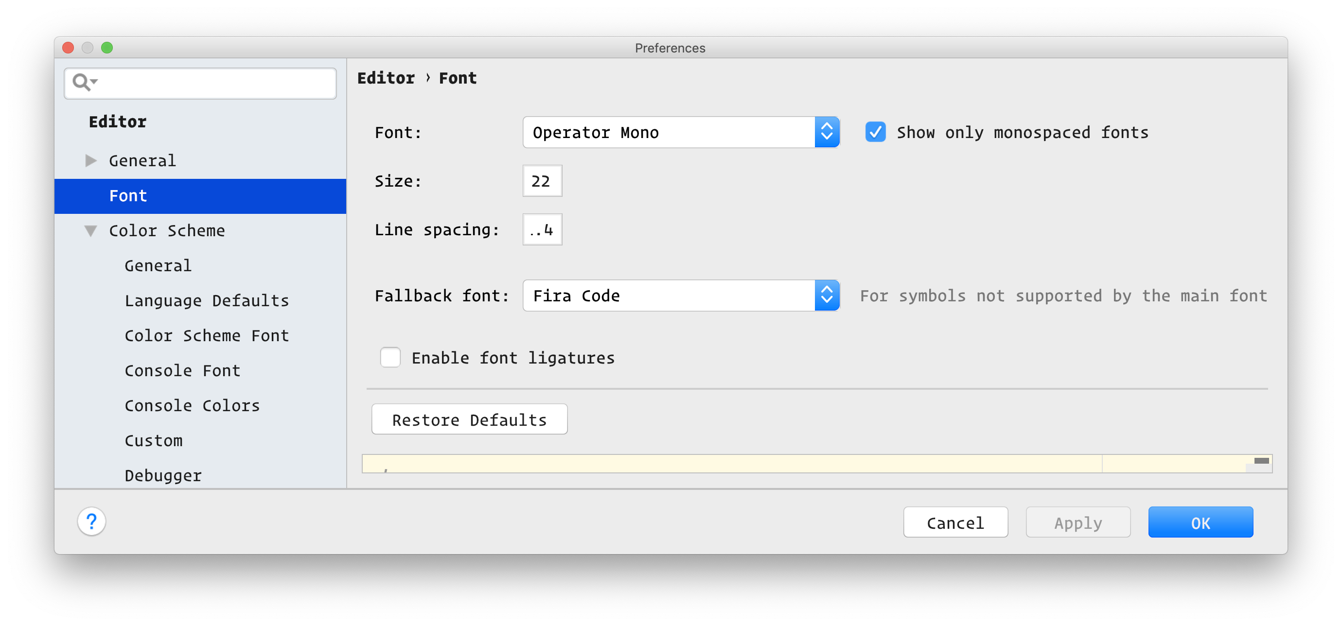
One of those things is choosing a font. The last years, I've been using Fira Code. It's the best free font I found out there for coding. In 2017, I wasn't ready to pay for a font. This changed this year, and I decided to buy Operator Mono. It is costly at $200, but since I have my own company now, I feel like it is worth it.
Font Sizes
Again, a great font is worth nothing without the correct sizes. This is still a personal taste decision. I like my font and line height big, so I can concentrate on the view lines of code I see. These are the font settings I currently use for both themes.
Console
As already mentioned, styling your console is a whole topic for itself. I already spend dozens of hours on creating my custom console in the last years. But it got a lot easier since I'm using oh my zsh with the Agnoster theme. You probably have seen it before, because it is quite popular.
In PhpStorm I only had to change the console colors to make them better fit the new theme colors.
The Result
In the end, you should choose what you like. I hope I could help you a little bit with that decisions by telling you about my new themes.
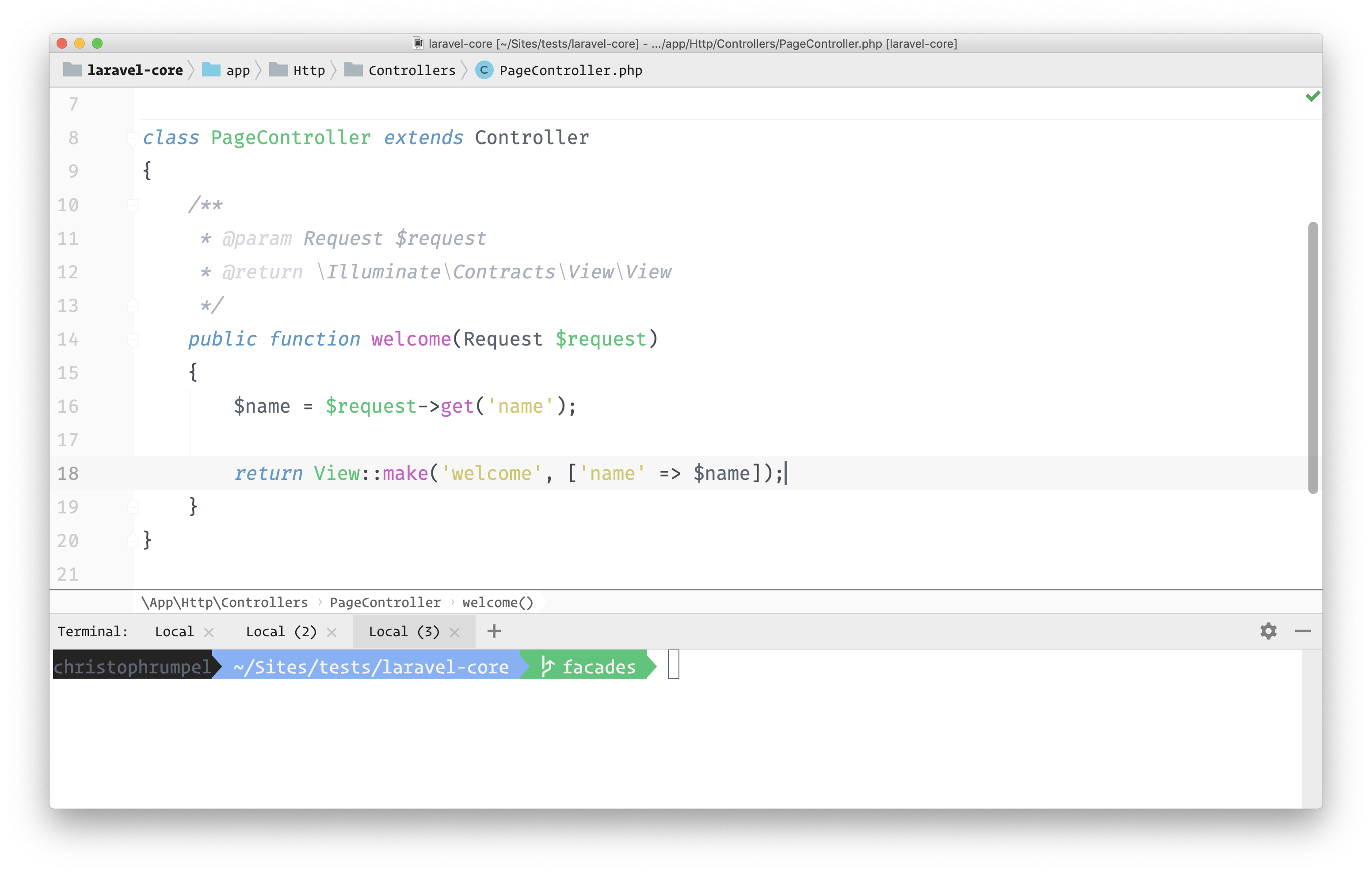
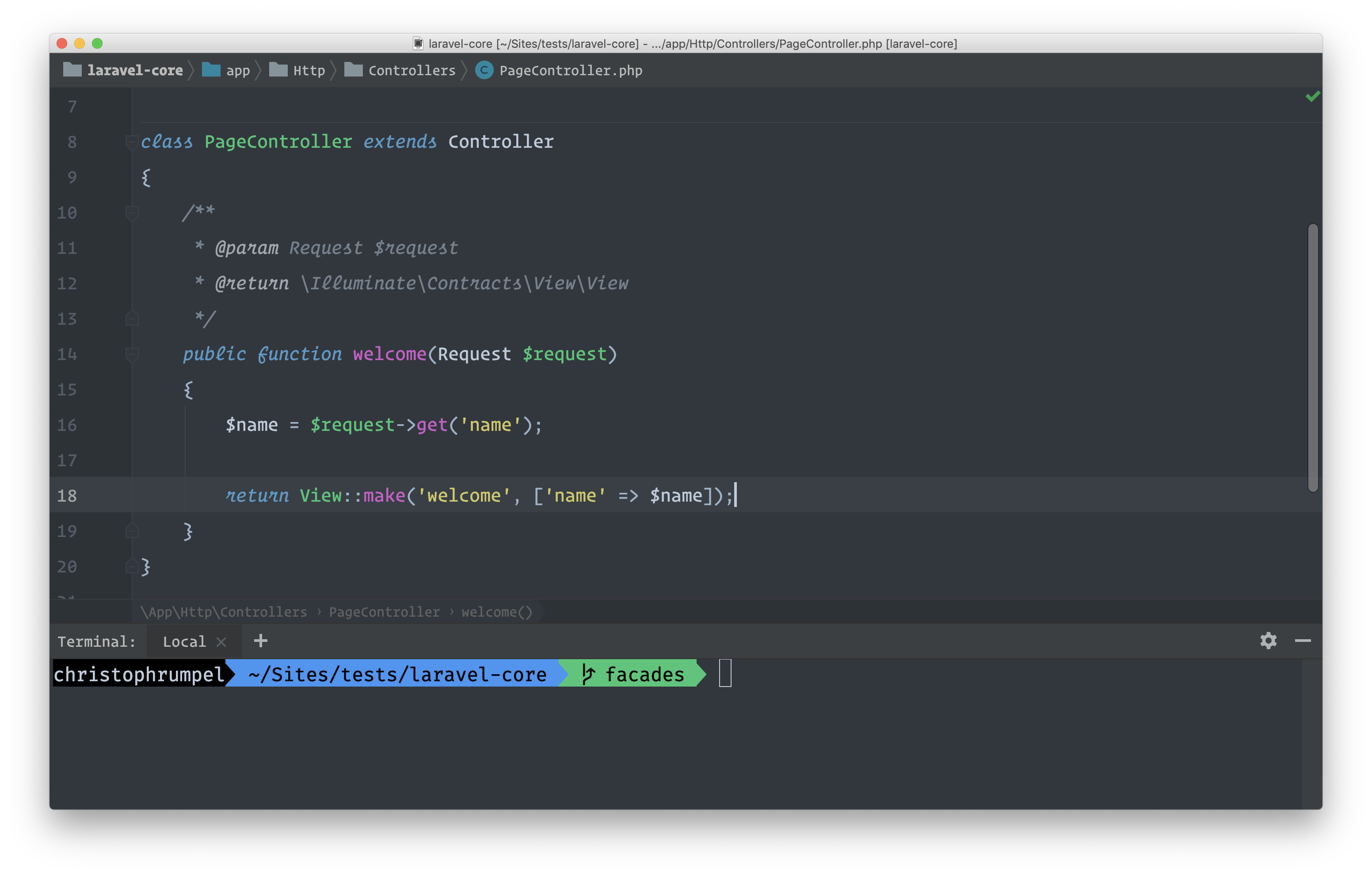
Finally, here are screenshots of both of my light and dark theme.
